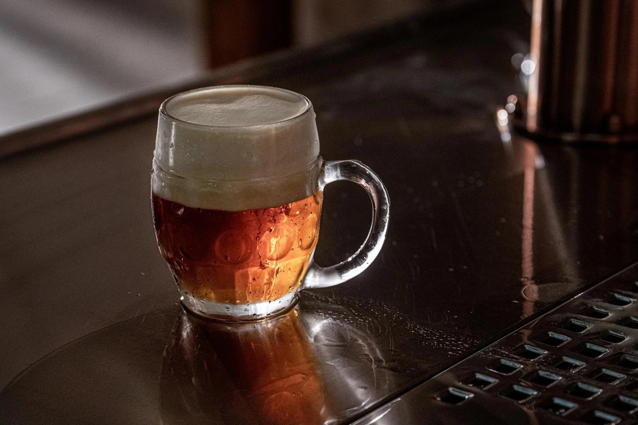
Litovel:
Rooted in Haná. Reimagined for today
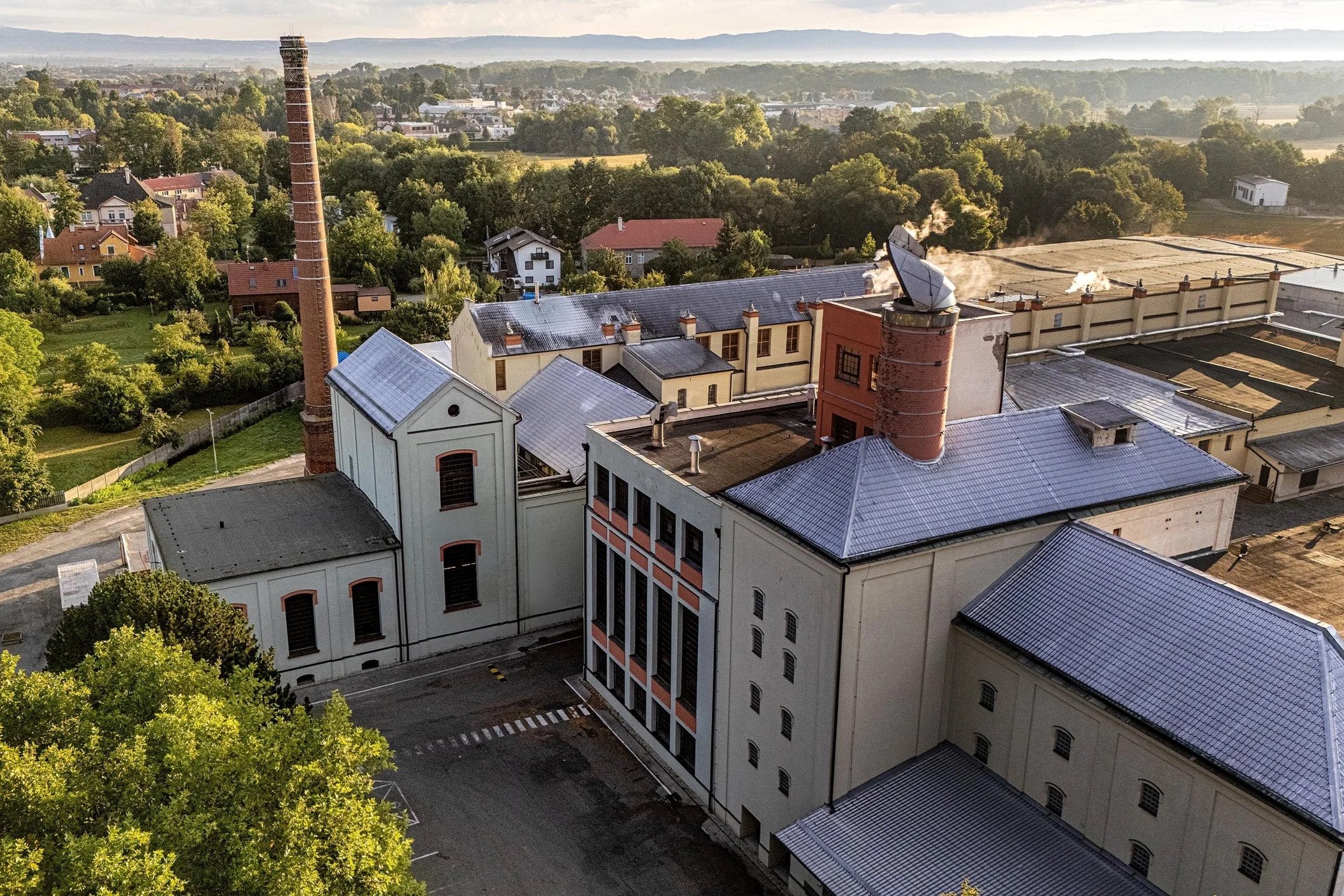
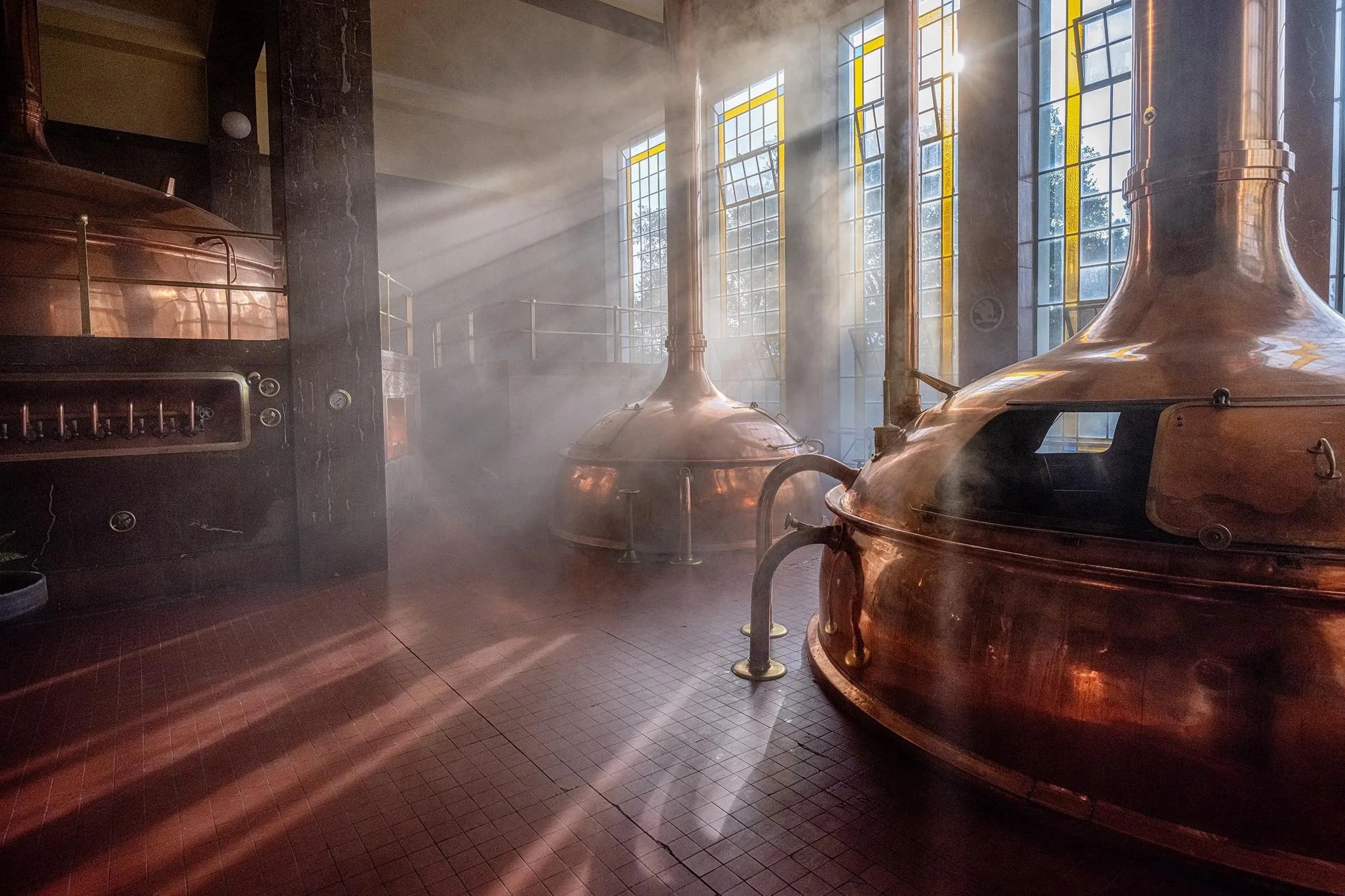
Litovel, a brewery with over 700 years of tradition, set out to refresh how it speaks to today’s drinkers - without losing what makes it truly Litovel. The result is a rebrand that doesn’t just update visuals, but reconnects the brand to its origins in a way that feels both authentic and relevant.
A region that shapes more than taste
Litovel has always been deeply tied to the Haná region - one of the most fertile and culturally rich areas of the Czech Republic. This connection became the foundation of the new design direction.
Rather than chasing trends, the goal was clear: translate heritage into a modern visual language. One that reflects the richness of the land, the pride of the region, and the quiet confidence of a brewery that has stood the test of time.
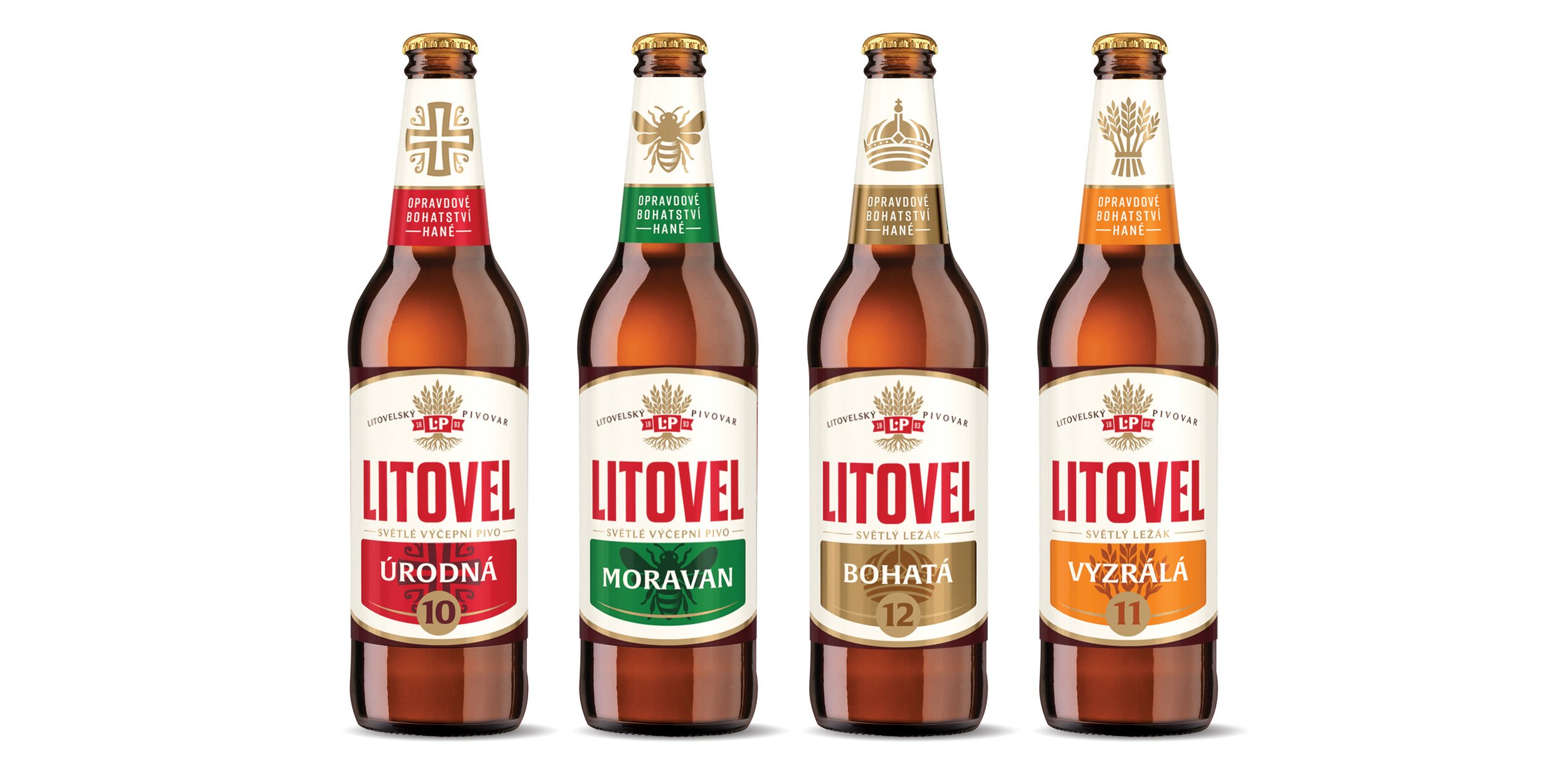
From Categories to Character: naming the beers
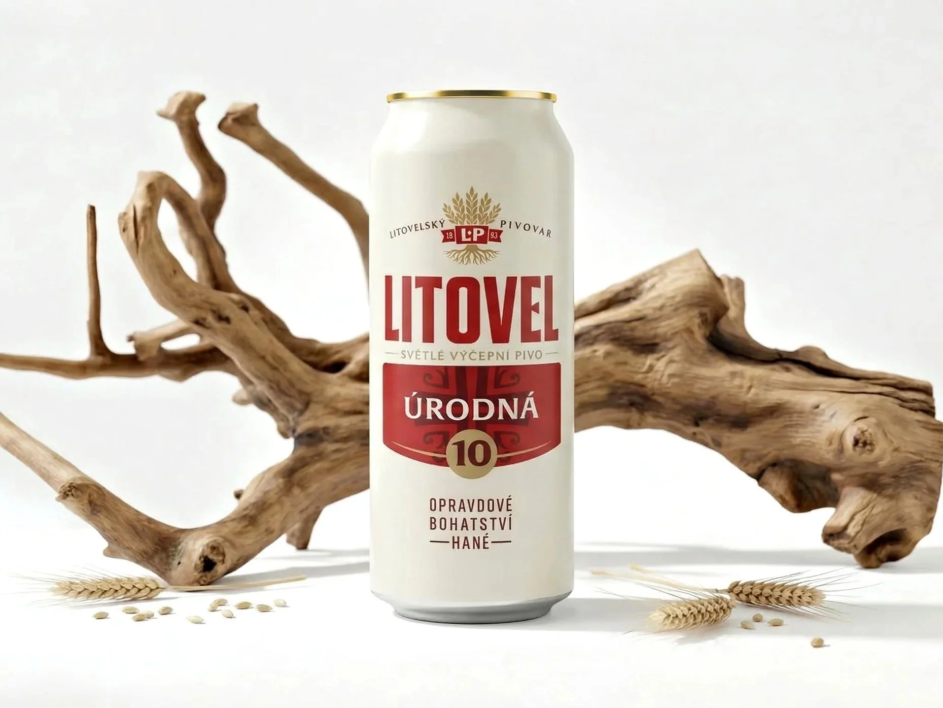
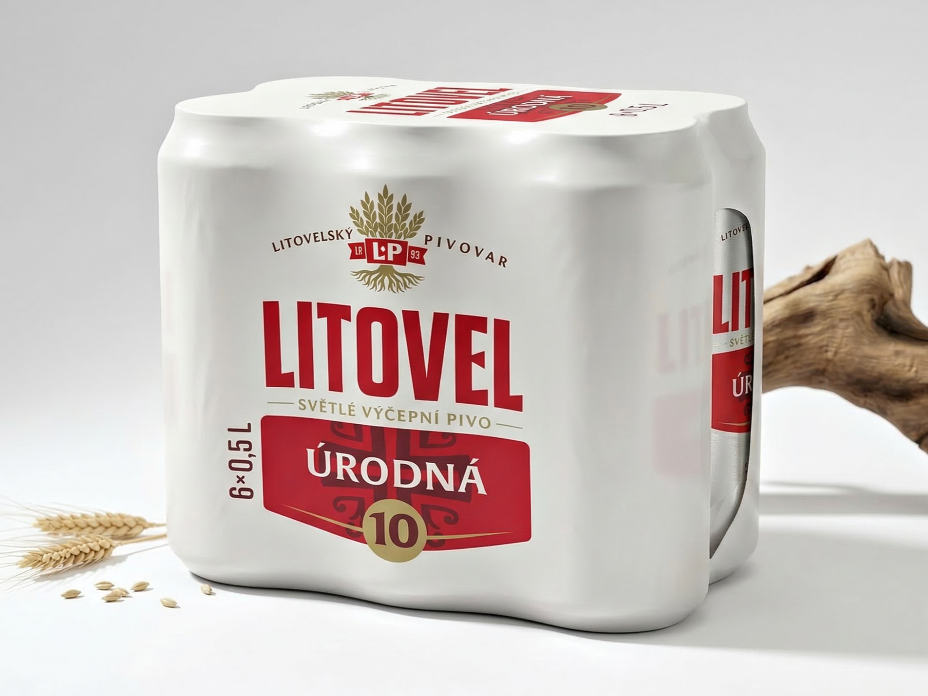
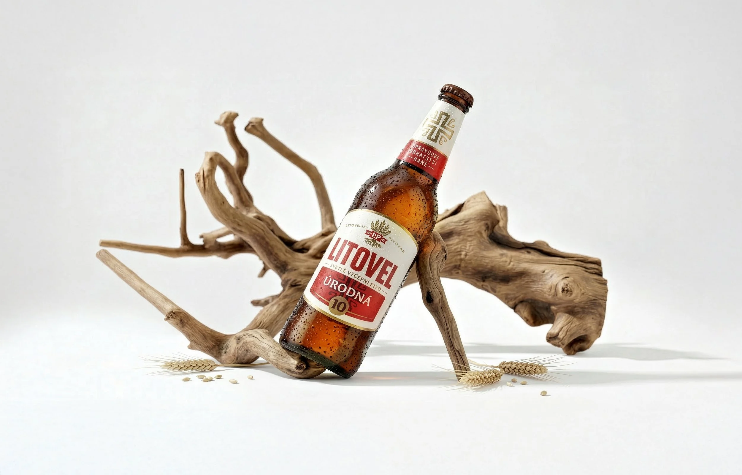
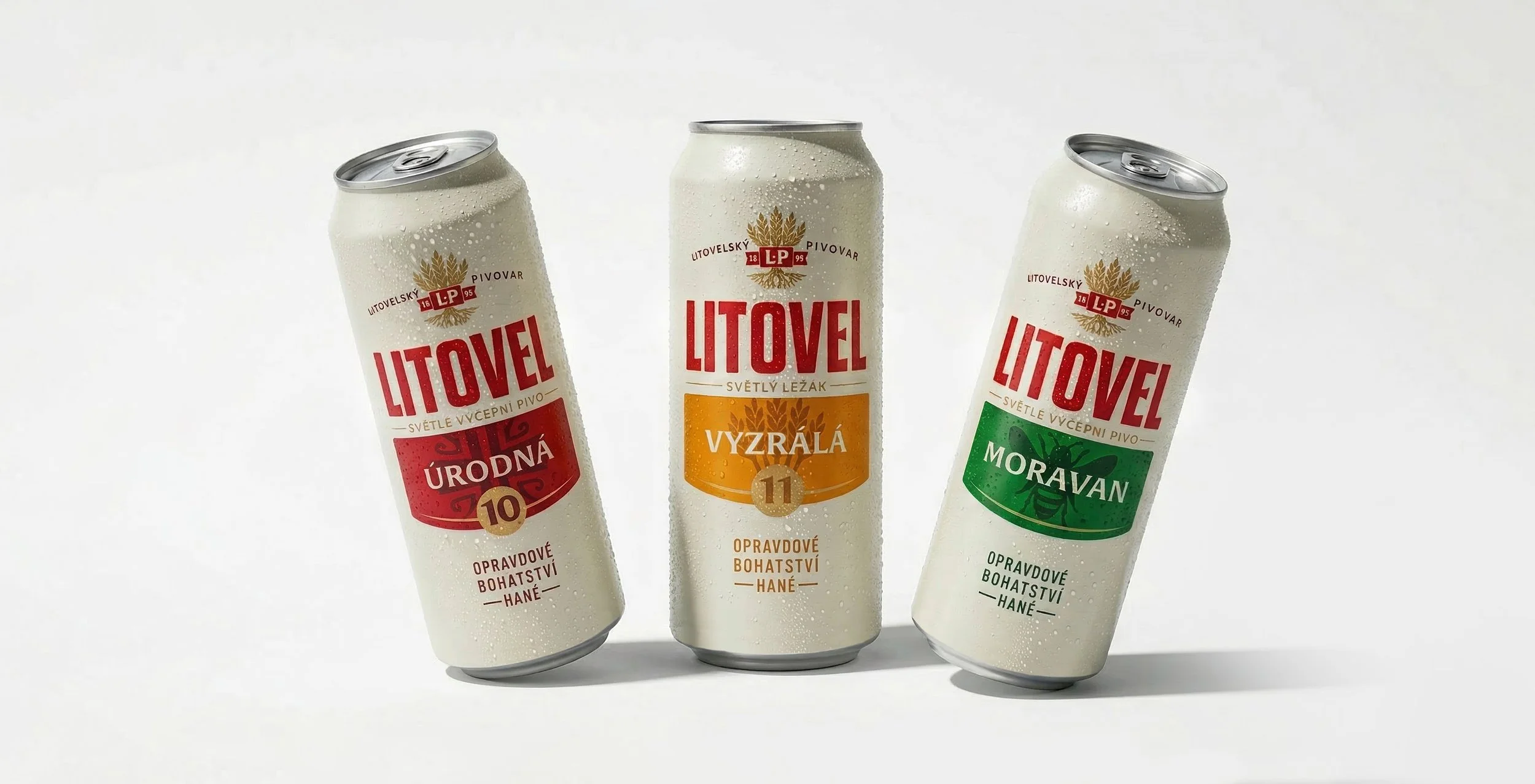
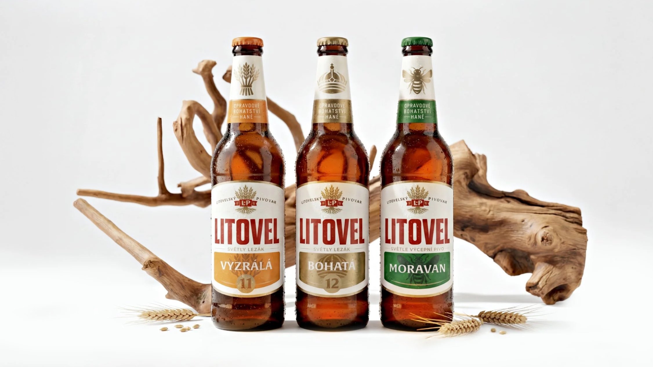
One of the most defining parts of the project was rethinking how the beers are named. Instead of technical labels, we introduced a naming system inspired directly by the Haná region - using expressive adjectives that reflect both the beer and the land it comes from. Names like Bohatá (Rich), Úrodná (Fertile), and Vyzrálá (Mature) don’t just describe alcohol content - they evoke character, origin, and depth.
This shift transforms the portfolio from a set of products into a collection of characters, making it more intuitive, memorable, and emotionally grounded.
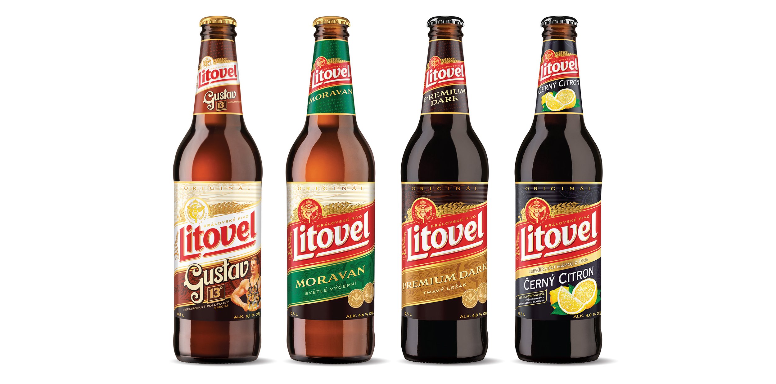
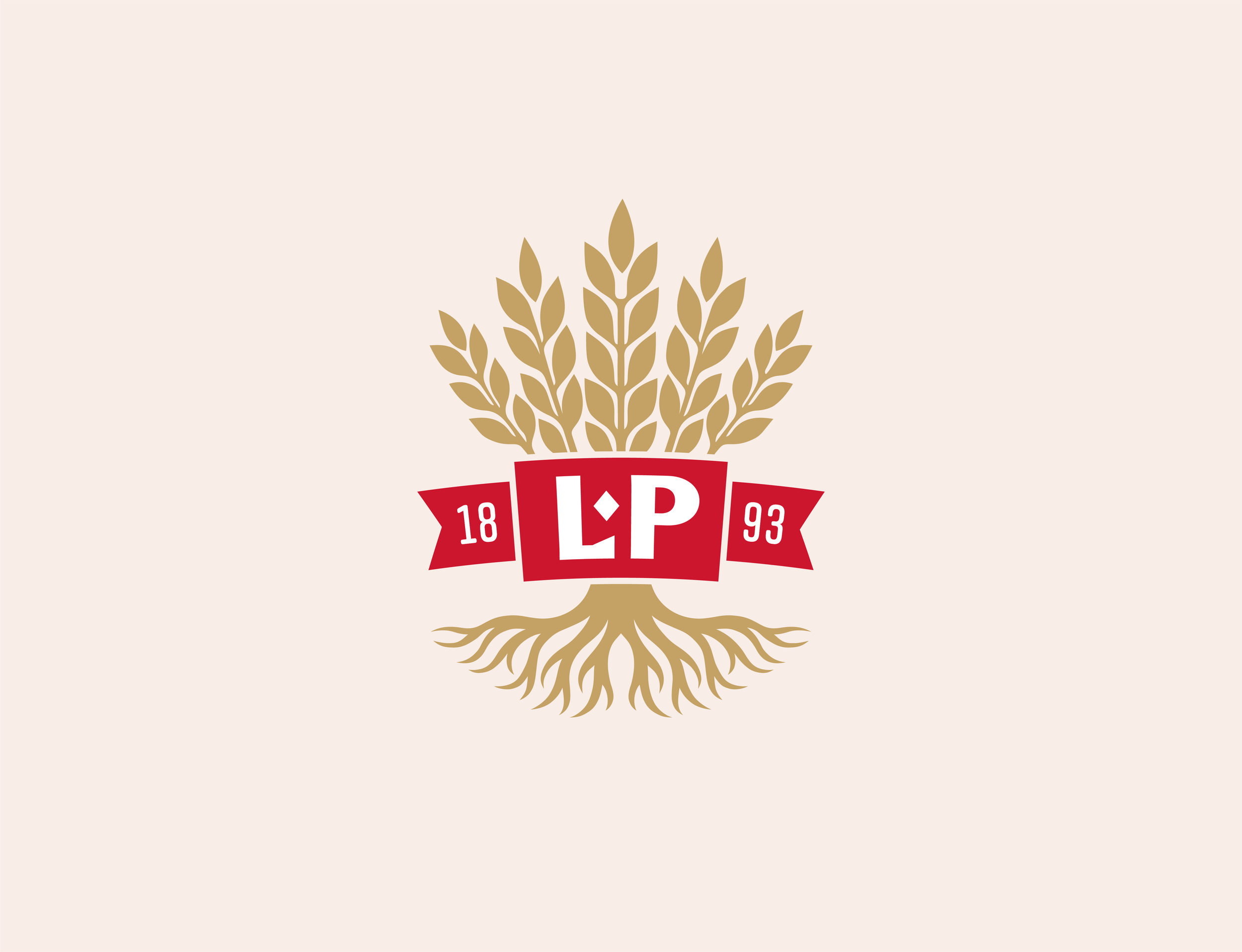
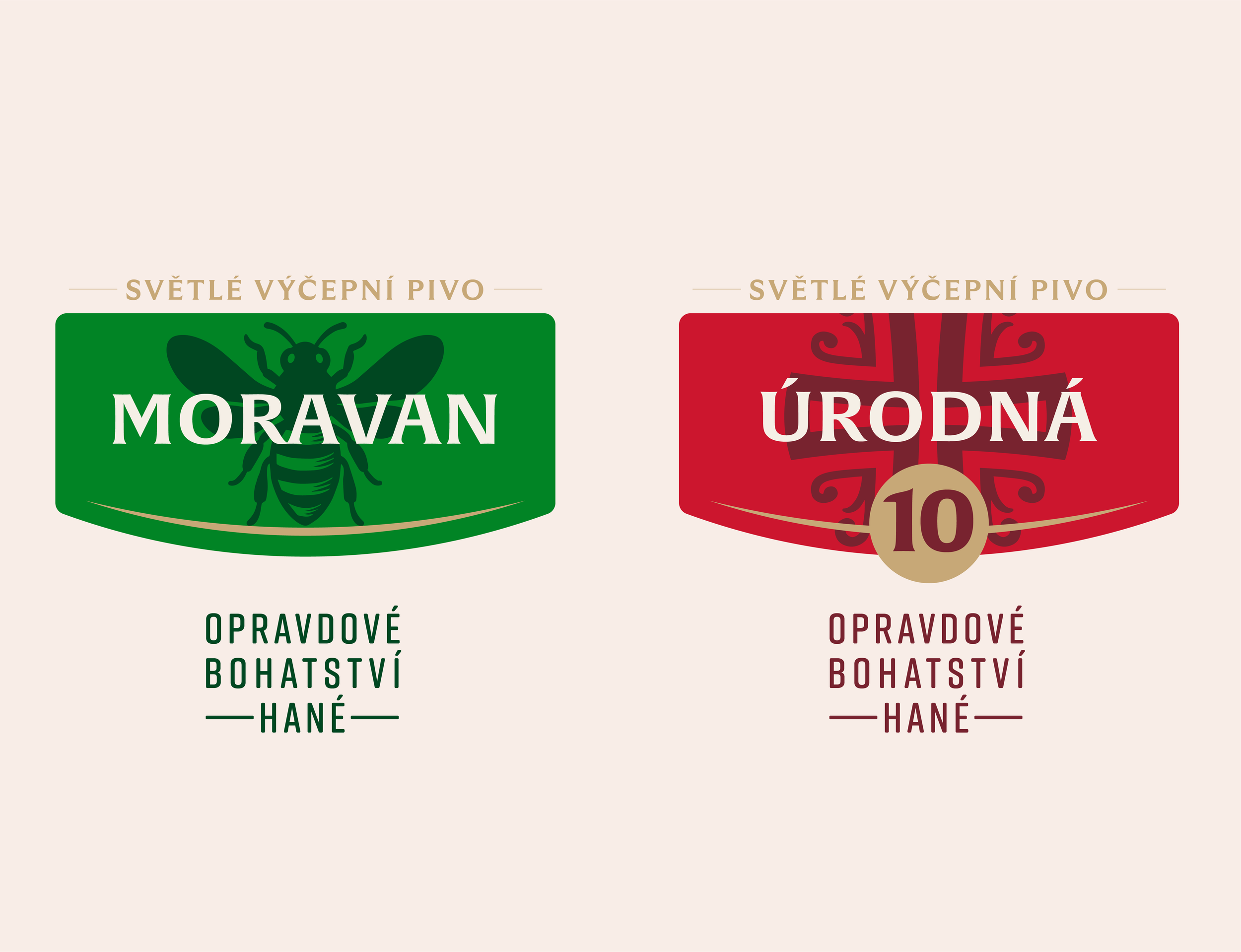
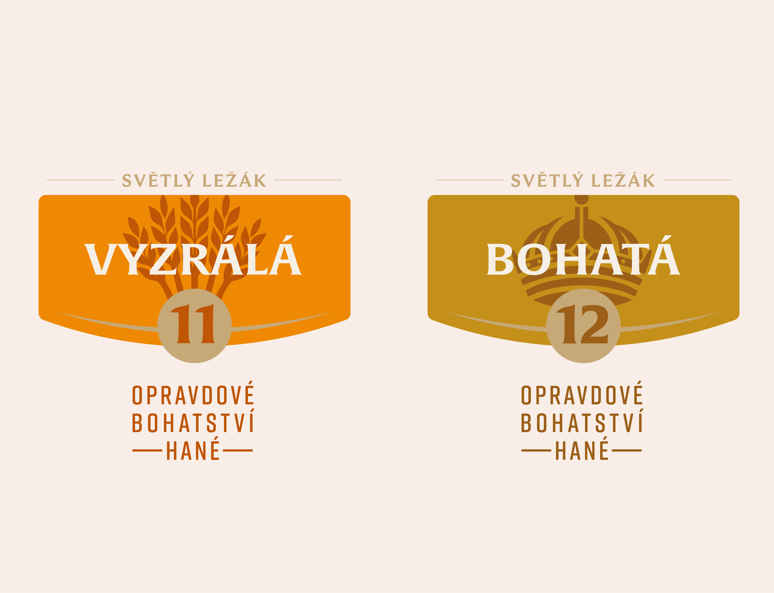
Symbols that speak the language of the land
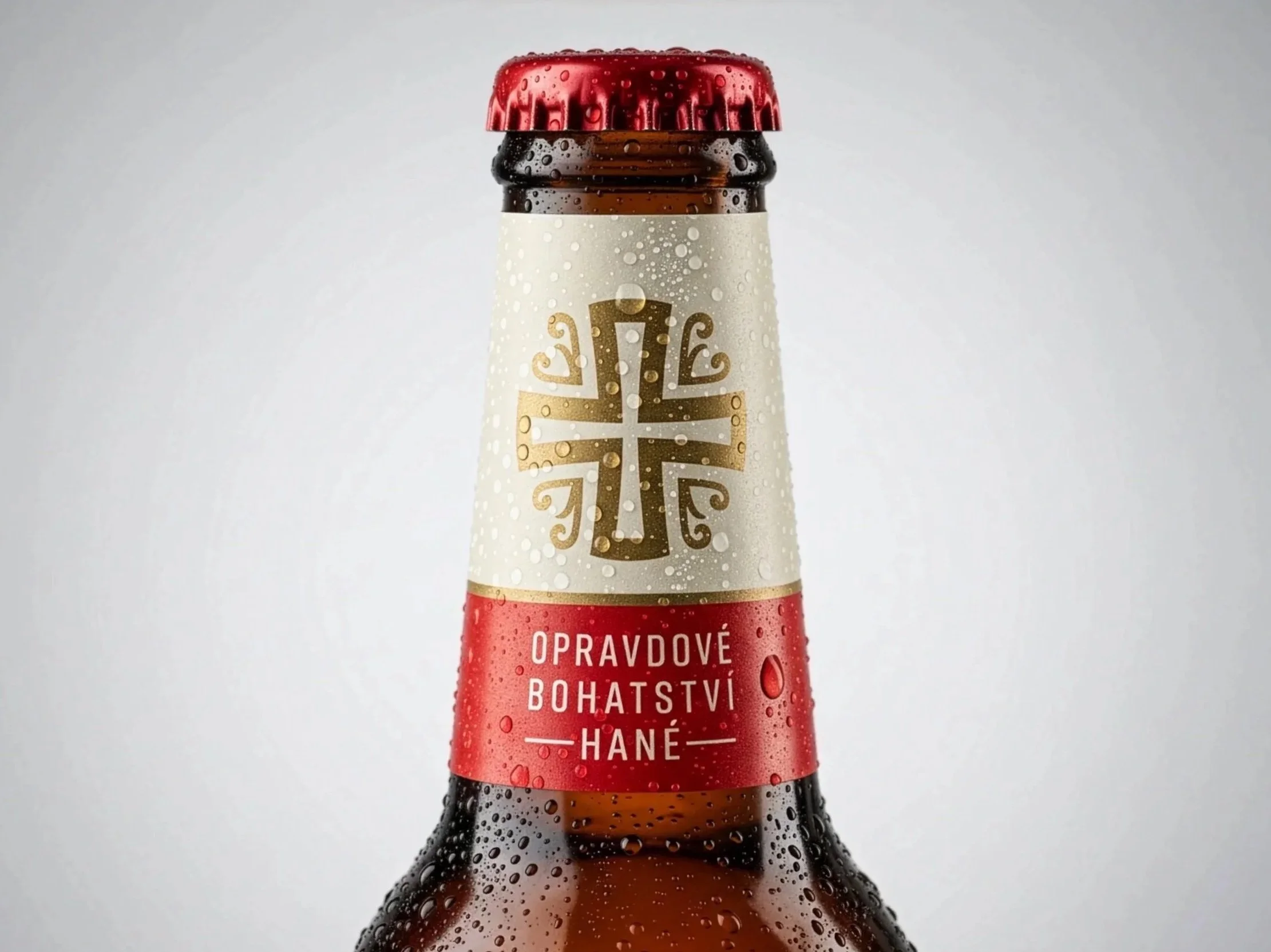
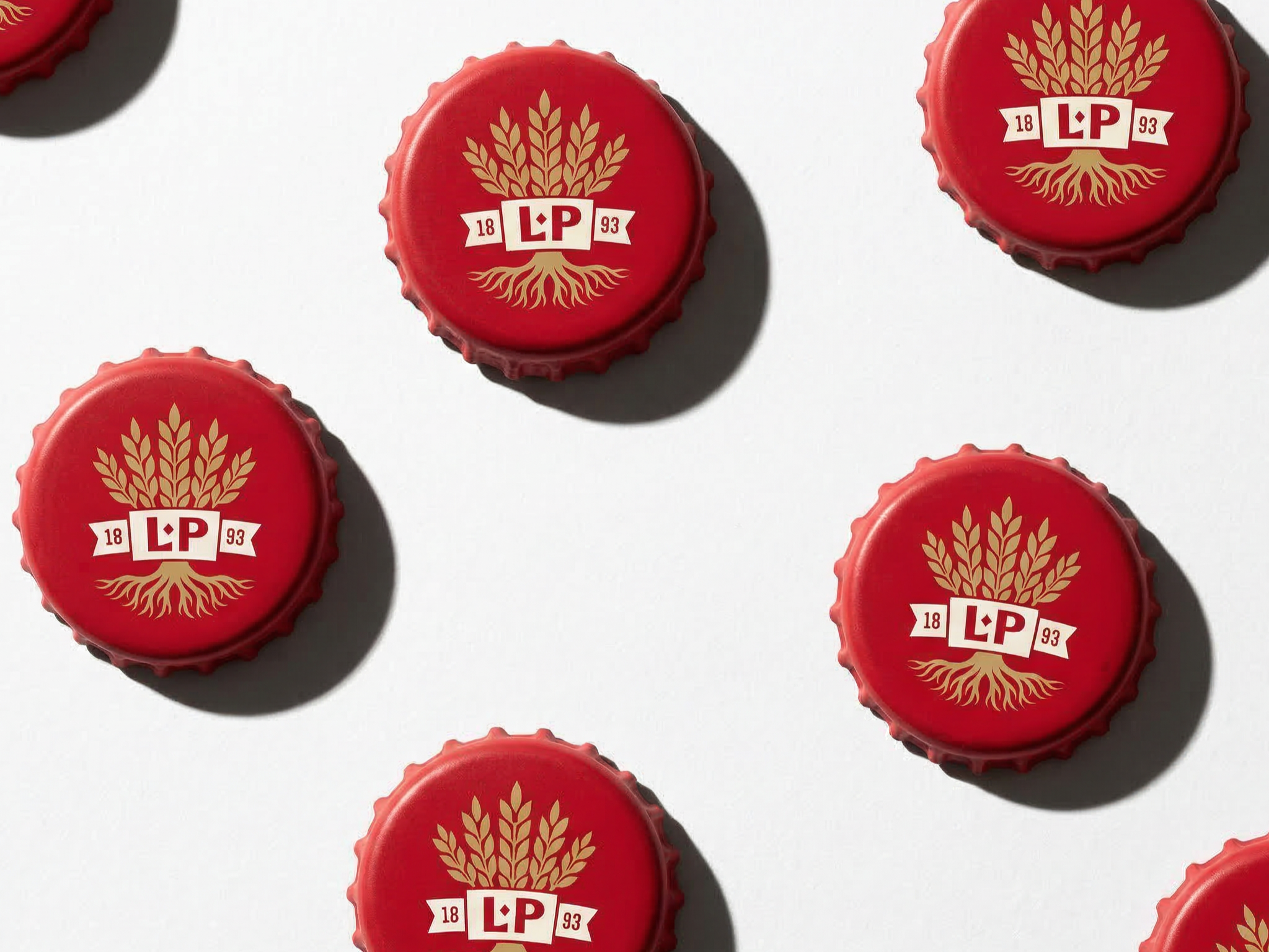
Alongside the naming, we created a system of visual symbols rooted in Haná’s cultural heritage.
From the bee - symbolizing diligence and natural abundance - to the cross and other heraldic elements referencing regional history and brewing tradition, each icon draws directly from the visual language of the land. Together, they act as meaningful anchors, connecting the identity to place, community, and generations of honest craft.
A brand that feels as honest as the beer inside
The result is a rebrand that brings clarity without losing soul.
Litovel now speaks in a way that is easier to understand, more engaging for a younger audience, and still deeply respectful of its legacy. Nothing inside the bottle has changed - but everything around it now tells a clearer, more compelling story.