Beton: A can-do refresh for an iconic Czech cocktail
Packaging design
Turning a national cocktail into a modern RTD? Tricky. Doing it without losing the edge (or the heritage)? The RTD category has exploded, with 10× growth in the Czech Republic since 2019. Becherovka needed in, but on its own terms, and with room to grow.
That's where we came in. BETON needed to feel fresh, contemporary and unmistakable, with modern edge to catch the younger crowd (and their camera roll).
Keeping the character
BETON has a loyal fanbase and a history dating back to 1967. The RTD shelf nowadays is noisy and crowded, so we had to cut through by balancing tradition with something that looks like it belongs in a 2025 fridge. We were after a bold structure, zero fuss and just enough Becherovka to keep your uncle happy.
Design that does the work
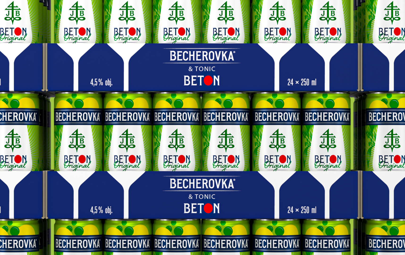
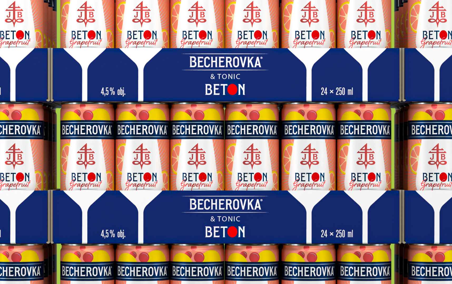
We built a system rooted in the category's best instincts: bold structure, contemporary edge and room to grow. The tone stayed crisp and the details stayed functional. Typography carries the name, flavour cues speak fast and the whole thing holds up both on and offline.
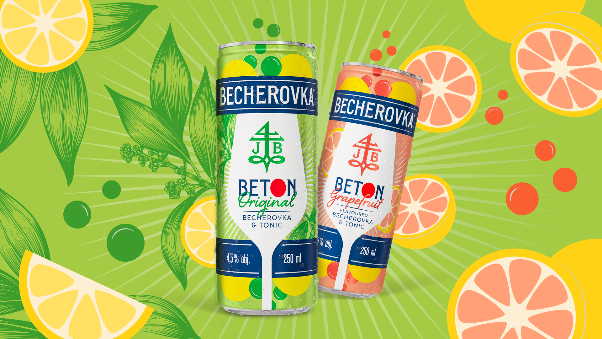
Makeover and beyond
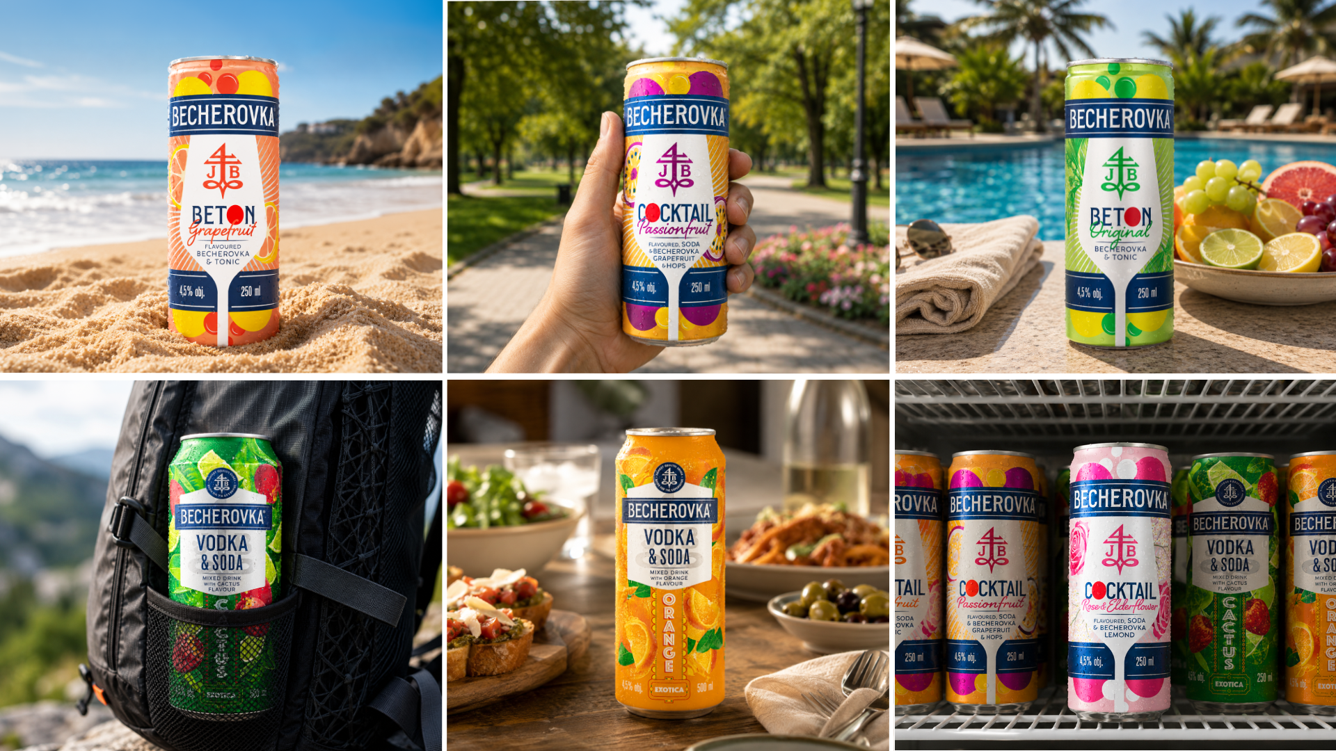
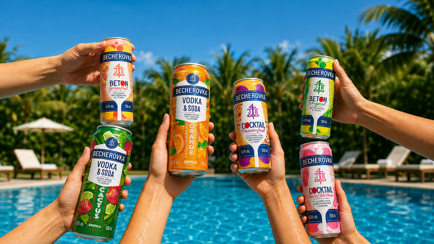
Two cans grew into a full portfolio: vodka sodas and fruit cocktails joined the tray, all carrying the same bold structure and crisp tone. Not only did we do a makeover, we fixed a visibility issue, a legacy challenge and a portfolio puzzle, all in one go. This is an old cocktail for a new audience, and now it comes in more flavours than your group chat can agree on.