Sezamo: Designed to delight
Brand identity, Logo design
Sezamo, the new star from e-grocery Rohlík.cz, needed an identity as lively as its fresh deliveries. And we like lively, so we set out to help them create a brand that’s as crisp and inviting as a freshly picked apple.

The perfect name
“Sezamo” – it’s playful, tasty, and a little magical. Like the sesame seed it’s named after, it’s small but mighty. And yes, there’s a nod to “Open Sesame,” because who doesn’t love the idea of unlocking something delicious?
A design that smiles
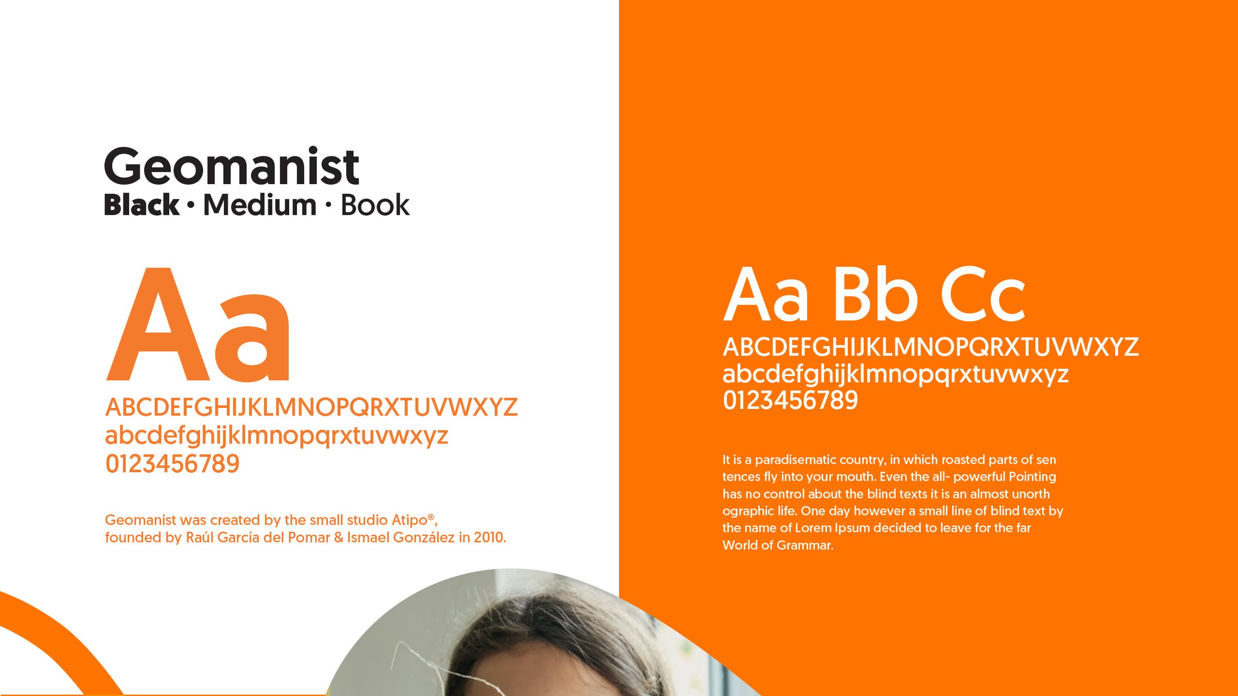
We wanted Sezamo to spread joy, so we built a logo with five sesame seeds forming a happy grin. It’s all about making people smile, whether they see it on a delivery van or on their screen. We chose bright oranges, yellows, and greens – colors that don’t just stand out – they make you hungry!


From screen to doorstep
We didn’t just create a logo; we built a brand experience. From the design of courier uniforms to the look of their digital presence, Sezamo’s identity feels real, with natural, unedited photos that show food just as it is – fresh and delicious.
With Sezamo, every order comes with a splash of colour, a dash of magic, and a whole lot of freshness. Ready to smile with every delivery? There’s always some mo’ with Sezamo.


