ZzzQuil Natura: Making sleep look natural on all fronts
Shopper experience
Most sleep aids look clinical and uninviting. ZzzQuil wanted the opposite: something that felt natural, comforting and visible on the shelf. We handled everything from brand strategy to pharmacy displays, stitching it into one consistent, human story.
The challenge: Natural, not niche
ZzzQuil Natura is a natural sleep gummy, but the stigma around sleep aids meant the design had to do more than explain what it was. It had to help people feel okay asking for help. That meant rethinking how these products show up in pharmacies, shifting the narrative from “treatment” to “everyday care.”

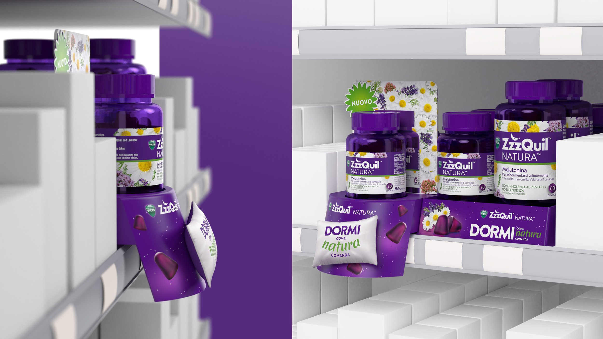
The approach: Clear idea, full-scope rollout
Our starting point was simple: gummies on a pillow, surrounded by flowers. It looked soft, natural and unlike anything else in the sleep-aid aisle.
From there, the project grew fast. We were involved in every part: strategy, creative direction, photoshoots, 3D visuals, video, motion content, giveaways and pharmacy-ready POS materials. Each piece had to feel calm, cohesive and genuinely helpful, whether someone saw it online, in-store or on their bedside table.
The category is full of sterile, medical noise. Ours felt different.

The result: A small gummy with a big shift
Within three weeks of launch, ZzzQuil became Italy’s top-selling sleep aid, and it also helped triple the category’s overall growth. A small, natural product people could trust — and a launch that made sure they saw it, understood it and felt good picking it up.
