
From heritage to hype: a new Aspall built for the CEE party scene
Packaging design
Molson Coors needed centuries-old Aspall to speak the language of Central and Eastern Europe's social scene. We took this refined British cyder and turned it into Pip & Wild, a fruity line extension ready for pre-parties, festivals, and those chill weekend nights. Strategy, naming exploration, packaging design from the ground up and just enough magic: all brewed in-house at Cocoon.
A drink with two personalities
In the UK, Aspall is premium. In CEE, cider is fun. We needed to bridge this gap, keeping Aspall's refined roots while making it feel at home on shelf next to the region's established cider brands.
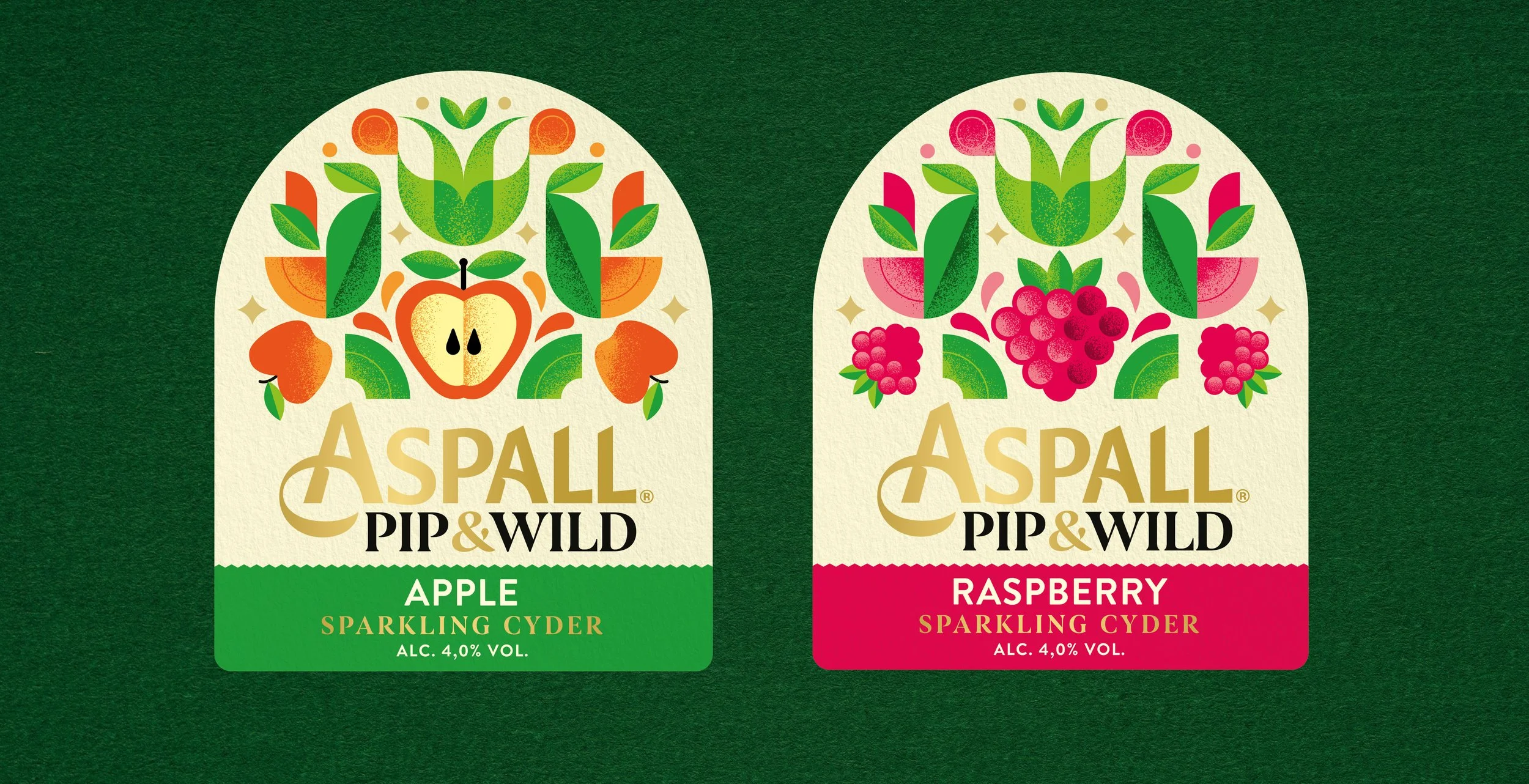
We shaped Pip & Wild with just the right bounce, then let loose with the design: expressive fruit illustrations, contrasts, clean layouts and a touch of British wit. It's premium, yes, but still approachable and playful.
Old name, new energy
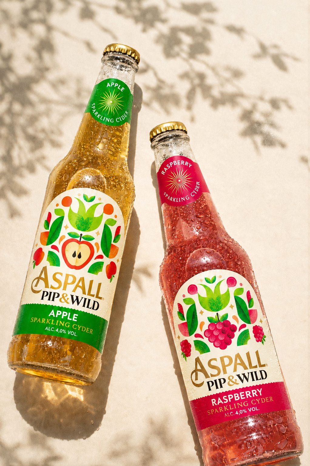
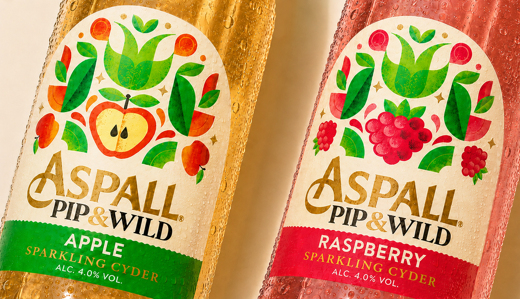
Cyder with a “y” knows how to party
A line extension that stays true to Aspall's quality but feels fresh in CEE. Pip & Wild looks great on shelf, speaks the right visual language and gives cider a whole new vibe. The heritage is there if you want it. But mostly, it just looks like something you really want to drink.